湛庐 CHEERS
ART DIRECTOR: Nod Young / Guang Yu
DESIGNER: Gao Han
COVER DESIGNER: Guang Yu / Nod Young / Yan / Tian Cai / JP / Liao Liao / Gao Han
YEAR: 2018
CLIENT: CHEERS Publishing
Cheers Publishing, established in 2005, has published Influence: The Psychology of Persuasion, The Economic Naturalist’s Field Guide, Big Data:A Revolution That Will Transform How We Live, Work,
and Think, and a lot of other classical books, and has been one of the most famous and influential brands. The book market has paid attention to CHEERS’ image starting with “Little Red Riding Hood” - a red-bottom
logo across the book back. CHEERS’ high-quality and continuous flow of content products have been widely recognized by readers, and the image of “Little Red Riding Hood” has also been deeply rooted in people’s mind. At the same time, visually conspicuousness and “effectiveness” have attracted a large number of
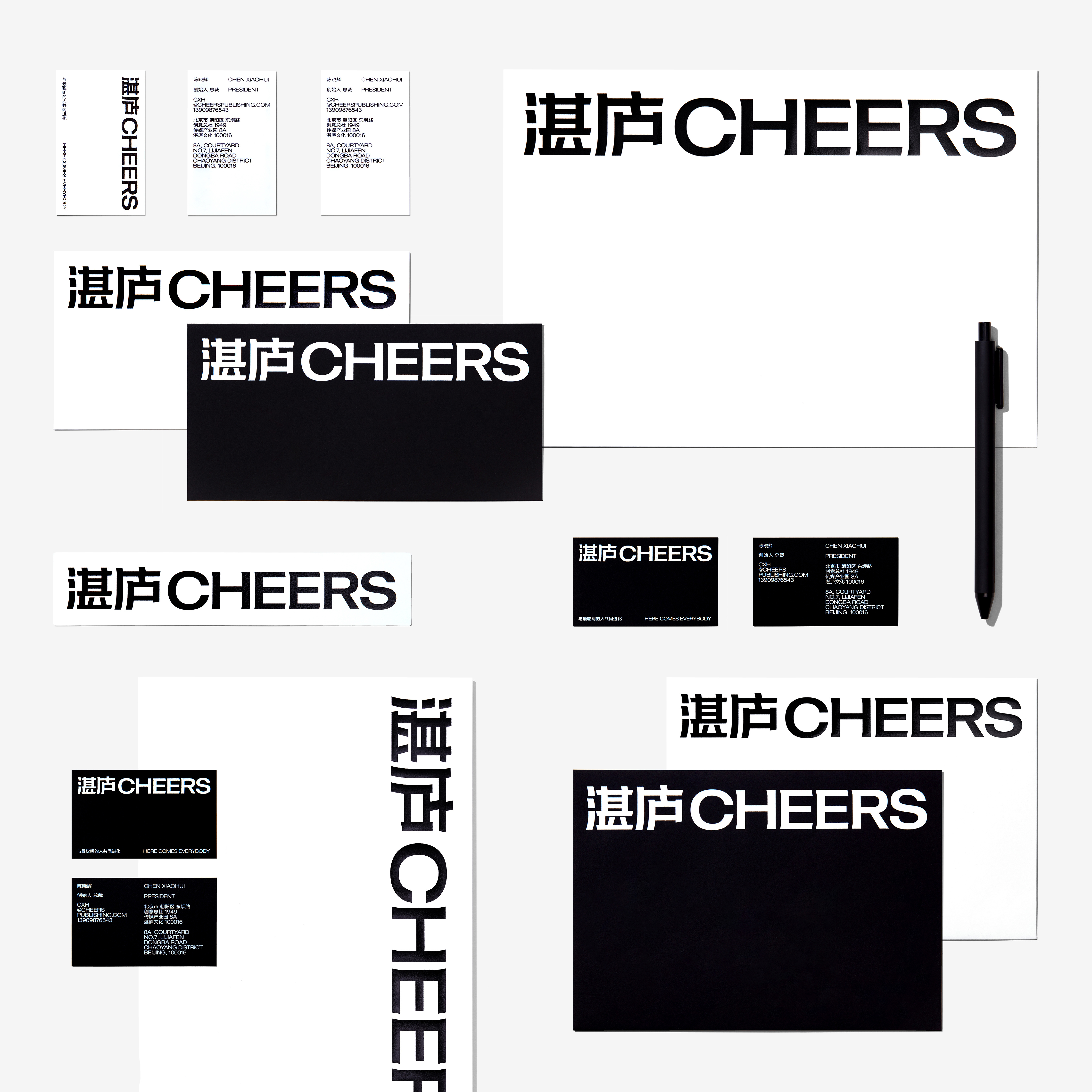
imitators. In the new brand upgrade, Cheers Publishing decided to give up on Little Red Riding Hood design, which was abused in the market. Instead, the “Information First” guideline is adopted to interpret the Cheers spirit for the Cheers brand and its whole set of products, by generating content output with clearer
and more concise information. The original brand logo “Cheers Publishing” is changed to “Cheers”,
which is shorter, more direct and inclusive.
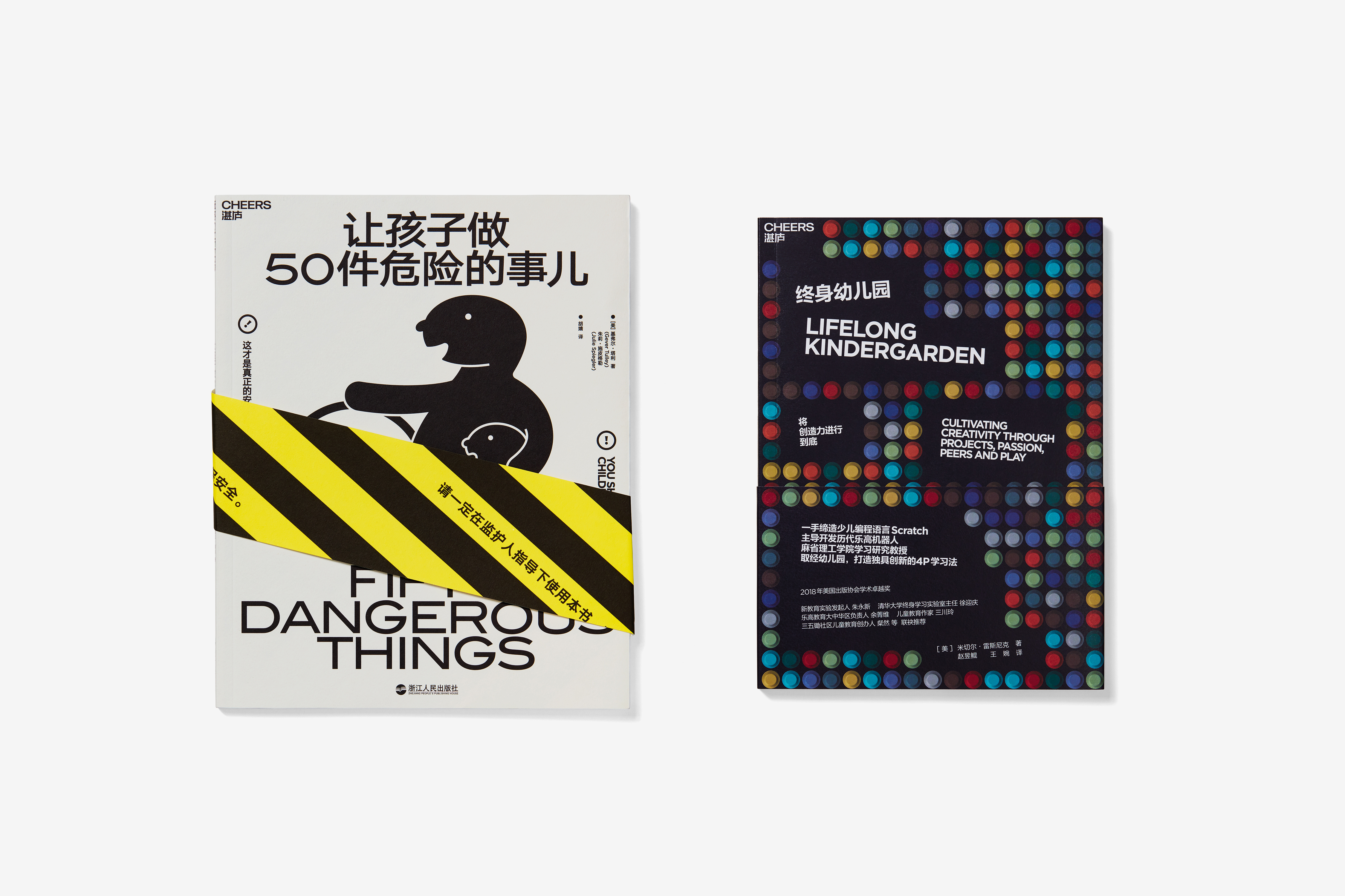
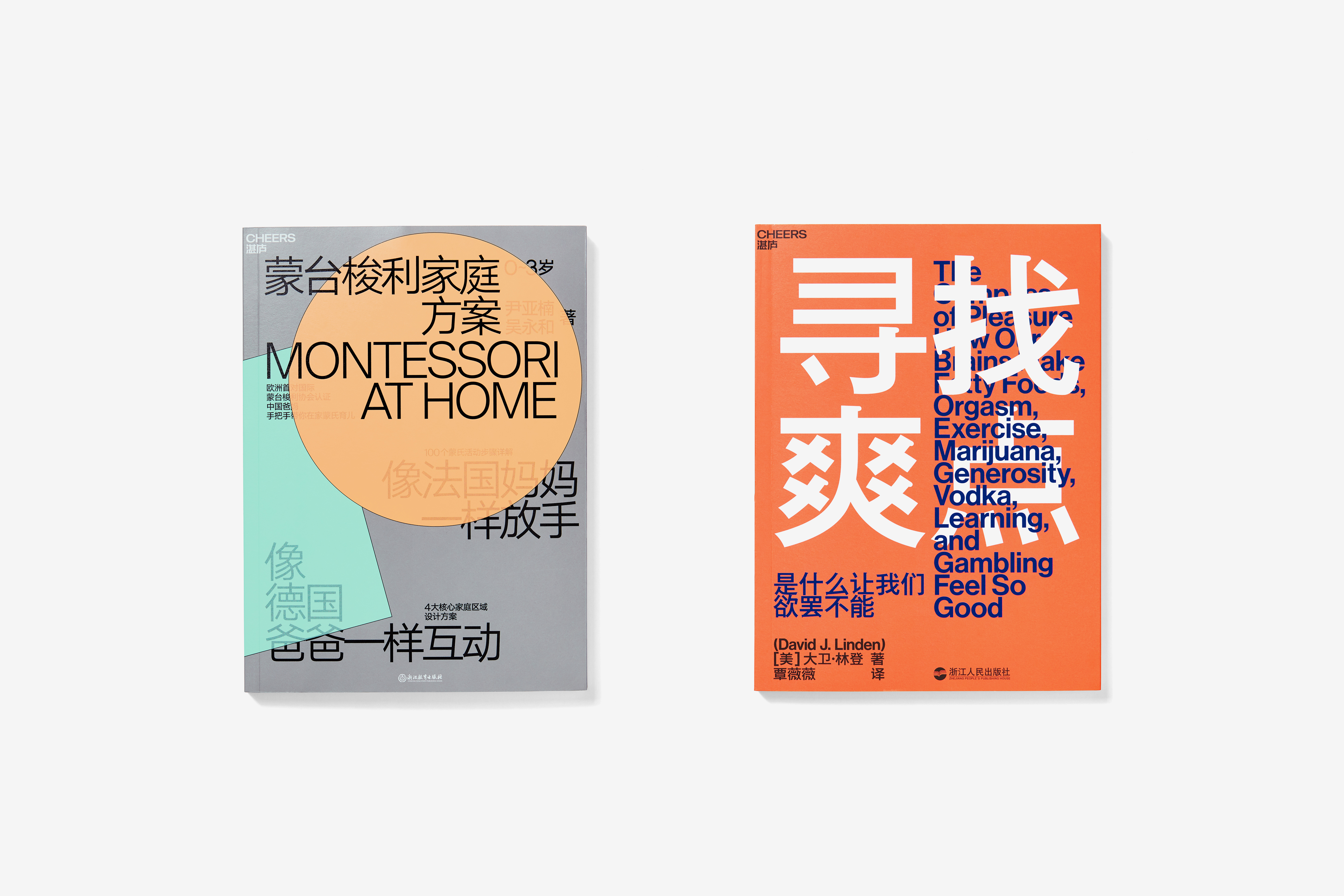
Among new books published by Cheers, we’ve made bold changes based on the international design style, making the connection between the Chinese and English language on the cover more natural and harmonious, and the information content more prominent, and removing the unnecessary graphics and pattern decoration, so that books published by Cheers Publishing have a strong individuality, attitude and characteristics, bringing new vitality to the drowsy publishing industry.
Among new books published by Cheers, we’ve made bold changes based on the international design style, making the connection between the Chinese and English language on the cover more natural and harmonious, and the information content more prominent, and removing the unnecessary graphics and pattern decoration, so that books published by Cheers Publishing have a strong individuality, attitude and characteristics, bringing new vitality to the drowsy publishing industry.
湛庐文化成立于2005年,出版了《影响力》、《牛奶可乐经济学3》、《大数据时代:生活、工作与思维的大变革》等大量经典书籍,是中国出版行业内最知名且最具影响力的品牌之一。图书市场对湛庐的形象认知始于
“小红帽”—— 一个横跨书脊的红底标识。湛庐高质量且持续的内容产品,得到了读者的普遍认可,“小红帽”的设计也已经深入人心。同时,视觉上的醒目和“有效”,引来了大量效仿者。湛庐在新的品牌升级中决定放弃被市场滥用的小红帽设计,取而代之的是在湛庐品牌及全线产品中,采用“信息至上”的方式来诠释湛庐精,以更加清晰简明的信息进行内容输出,并将原有的品牌标识“湛庐文化 Cheers Publishing”变更为“湛庐
Cheers”,更加短促、直接、概括。
在湛庐出版的新书中,我们基于国际主义设计风格进行大胆的改造,让封面中的中文与英文连接更为自然融洽,信息内容更加突出,去除了不必要的图形和图案的装饰,使湛庐出版的图书具有强烈的个性、态度和特征,为昏昏欲睡的出版行业带来新的活力。
在湛庐出版的新书中,我们基于国际主义设计风格进行大胆的改造,让封面中的中文与英文连接更为自然融洽,信息内容更加突出,去除了不必要的图形和图案的装饰,使湛庐出版的图书具有强烈的个性、态度和特征,为昏昏欲睡的出版行业带来新的活力。